Ladies and gentlemen, boys and girls, and to the snake in my bedroom, I present to you the future of CSS layout and boy is it a game changer. CSS Grid is finally upon us and totally changes the way in which we as web developers create layouts on a webpage. As it says in the title, it is the holy grail of CSS layout, making it easier to create simple and complex layouts. With that said I decided to take on and learn grid as a self-initiated project, so allow me to show you want I've achieved.
A bit more detail about Grid
Before I go into detail about what I came up with while learning grid it's best to have a better understanding of what it is first. CSS Grid (aka Grid) is a two-dimensional grid based system allowing the ability to place items in both columns and rows, unlike flexbox which is one-dimensional and can only place items in either a column or a row, it can't handle both. Grid is the very first CSS module created specifically to solve the layout problems we've all been hacking our way around for as long as we've been making websites.
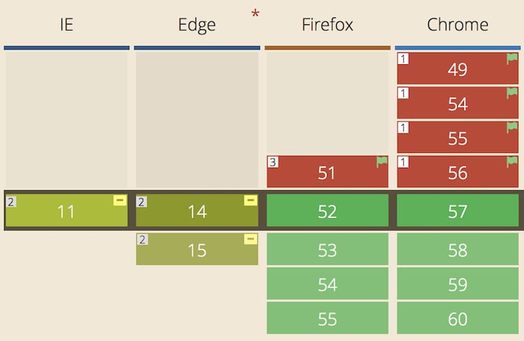
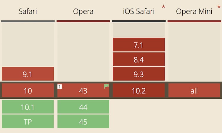
Current browser support
Being a new feature for browsers, it shouldn't be a surprise to know that grid isn't widely supported across all browsers (yet 😉). However, in the past week it has been released in the latest update on Firefox (version 52) and Google Chrome (version 57), with Apple getting ready to release it on Safari (version 10.1) within the coming weeks.
My project set-up
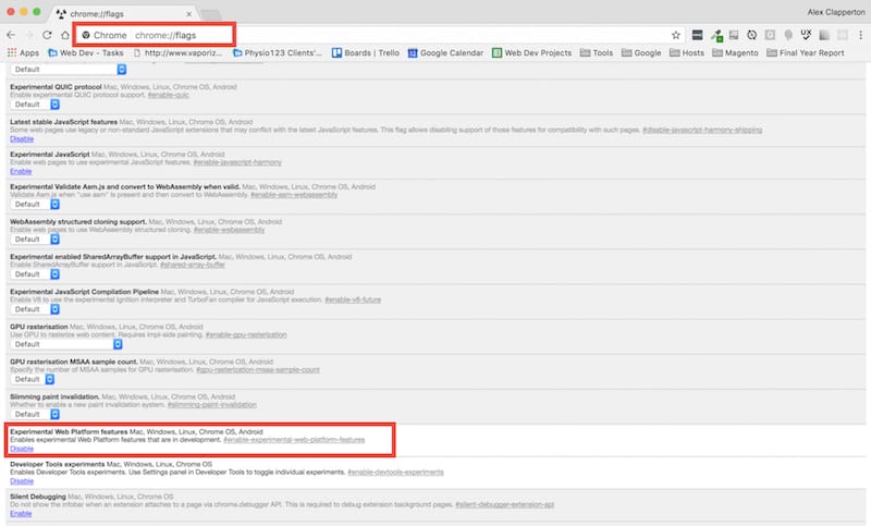
At the time of learning grid, none of the browsers mentioned above supported grid natively. So, in order to play around with grid, I had to download developer versions of the browsers which contain experimental features (such as grid at the time) that aren't available on their native counterparts. For Safari, you can download Safari Technology Preview, for Firefox you can use Firefox Developer Edition and for Google Chrome you can either download Chrome Canary or enable experimental web platform features in Google Chrome by typing chrome://flags in the address bar.
In addition to this, I used two online resources, Rachel Andrew's Grid by Example website and Chris House's A Complete Guide to Grid article from CSS Tricks. Both these sites contained excellent information about grid as well as some excellent demonstrations.
Putting Grid into practice
With Grid being a self-initiated project, I decided to have a bit of fun with it. I created two little games for myself on CodePen, where I sliced up two images in Photoshop and just using Grid, I had to place the sliced parts of the images in the correct place to re-build the images. You can have a look at what I created below. Make sure you are using a browser that supports Grid.
I've not finished yet
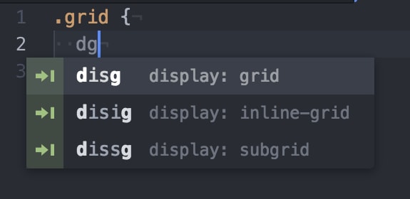
While learning grid, I wanted to find a way to make it quick and easy to write the grid property names as there are quite a few of them and some are quite long. One thing I tried was to find a snippet package for my text editor Atom where I could write shorthand's for the grid property names without having to write the whole thing. To my disbelief there wasn't a single snippet package for grid that I could find for Atom, so I took it upon myself to create the package myself. If you are interested, you can install the package yourself in the settings section of Atom, or you can check it out on my GitHub repo. I also made a Sublime Text version which you can find on my GitHub repo.
How to learn Grid
There are now a variety of articles and tutorials that you can find on the web to learn about Grid. The biggest hurdle to overcome is finding out the grid system works as you can't physically see the grid lines in the browser (Not entirely true, more on that below) and so you have to try and plot out mentally where the grid lines would be. This is where Rachel Andrew's Grid by Example website and the A Complete Guide to Grid article on CSS Tricks are the places to go. Like I mentioned earlier, these sites provide an in depth look on how grid works, the property names of the grid container and grid items and provide a variety of examples of how grid can be used.
Does this mean the end of Flexbox?
I would imagine some of you are thinking "well if grid is so great then what's the point of using flexbox anymore?". My answer to that is by no means is flexbox dead. Grid is not a replacement of flexbox. It is simply an alternative layout method and there are occasions where both can work together. Don't believe me? Then maybe this CodePen from Rachel Andrew will change your mind. To convince you further, checkout this article from Rachel on when to use grid and when to use flexbox.
Final thoughts
When I started looking into grid, I thought that it was going to be too complex to get my head around how it would work and trying to remember the property names. But since then I feel I have come a long way and found that it isn't that complex at all. The main barrier is understanding how it works and the purpose of the property names and I feel with creating the snippet for my text editor, has contributed to me learning grid in a short space of time.
Bibliography
House C. (2017). A Complete Guide to Grid [ONLINE] [Accessed 20 February 2017]. URL: CSS Tricks
Andrew R. (2017). Grid by Example [ONLINE] [Accessed 20 February 2017]. URL: Grid by Example